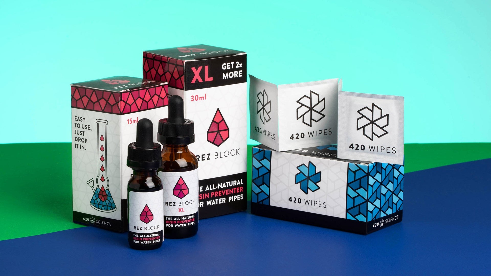
The New Look of Rez Block and 420 Wipes
A Redesign with a Purpose
Early in 2018, we decided it was time to redevelop the branding on some of our in house products. In particular, we set out to breathe some new life into the packaging for Rezblock and 420 Wipes, but we also intended to create a more unified look for any products we may launch.
While 420 Wipes and Rezblock are still going as strong as ever, we needed to update the packaging to something more modern. These products are nearly a decade old and needed an update to refresh their image. Since their creation, other competitors, and the extensive flooding of the cannabis accessory market had made it necessary for our packaging to jump off the shelf.
Redesigning was no easy task because each of our products was launched at different times. This spaced-out creative process led to them having separate branding, which wasn't necessarily unified. We knew correcting this issue would make both our brand and the individual products more noticeable and recognizable.
 Historically our in house designer has done most of our design and branding work. But for the larger project of merging our products into a more cohesive vision, we knew the situation required an outsider perspective, and we sought out the renowned designers at High Road.
The High Road Design Studio focuses specifically on cannabis consumer products, and their focus is on the commercial interior design of dispensary spaces. They've done ground-up design for dispensaries and many in-house brands of cannabis products. High Road provided us with an authentic collaboration experience where we worked with them over several months to decide the direction and style of our new product packaging.

The geometric symbols representing Rez Block and 420 Wipes presented a cohesive look when joined together in repeating patterns. By themselves, each logo is differently shaped, but when united, they both form triangular patterns that are reminiscent of one another.
This geometric repeating logo pattern can also be recreated for other products that we decide to refresh or make in the future. This ability to maintain branding cohesiveness with past and future products gives the new design a flexible and robust framework. We're excited about the new visuals for these 420 Science classics and looking forward to expanding it to other products as well.
Find out more about the redesign in our video: